Having just reviewed hundreds of album covers in various music categories, I have come to the conclusion that new album releases in Classical and Jazz music need to get with the program. Much is dated and just boring to look at.
Other categories such as Alternative rock, Pop, Dance, Electronic, Hip-hop… people working in these industries have an understanding that a cover design can really help capture the attention of potential consumers. But maybe this relates more to certain categories and target audiences. As they say “don’t judge a book by its cover,” so why would you judge music that way? Even if this is true, I still think if you are looking for something fresh and unknown, a beautiful album cover can definitely entice interest to listen to the tracks.
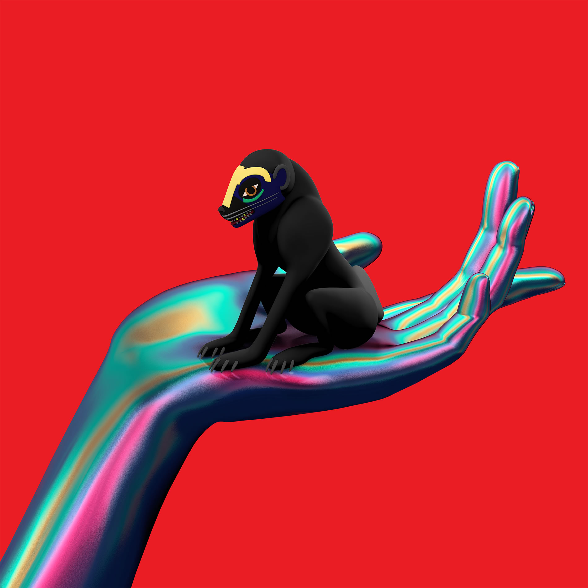
Top: SBTRKT dedicates “Wonder Where We Land” to his brother who passed away just before the album recording.

Art Director A Hidden Place has created modern versions of native society ceremonial masks for SBTRKT.
Wonder Where We Land
This is a photo of SBTRKT wearing a ceremonial mask which he uses during his concerts. The actual album cover is the red one at top with a hand and black creature—a great piece of eye-candy that could possibly sneak into a color-coordinated scene of “The Grand Budapest Hotel.” The background in contrast with the metallic sea shell effect of the hand is stunning, and this color palette has also been used on the musician’s official website.
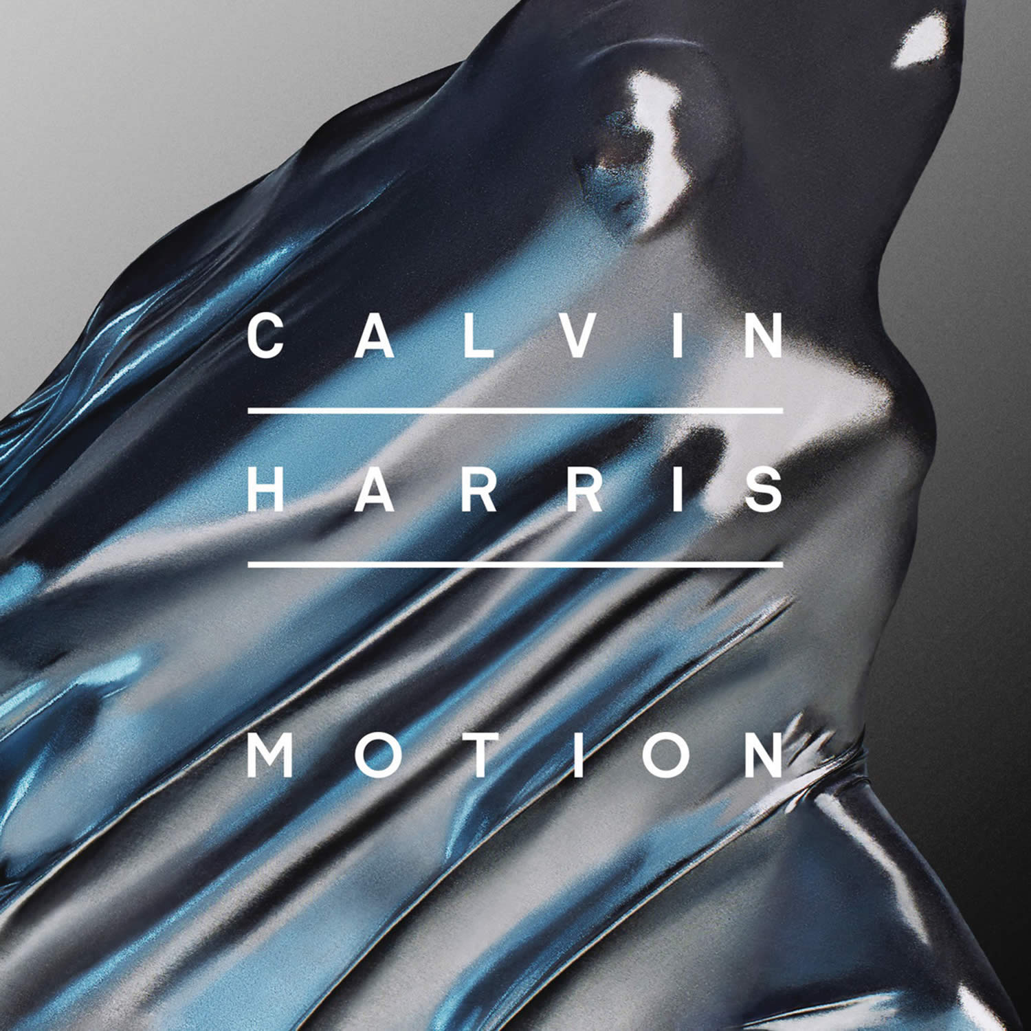
The first single from “Motion” is “Under Control” (featuring Alesso and Hurts).
Motion
“Motion” is Calvin Harris’ fourth album released on November 4, 2014. This Scottish DJ has been producing dance-floor hit after hit. Whether you like his electropop music or not, his album cover is a work of art—an irregular sculptural form in silver and glittery-blue colors. It looks abstract, but with a head emerging from a cloth-like material it presents something recognizable to the viewer, like a dancer in motion. The composition is graceful, gorgeous.
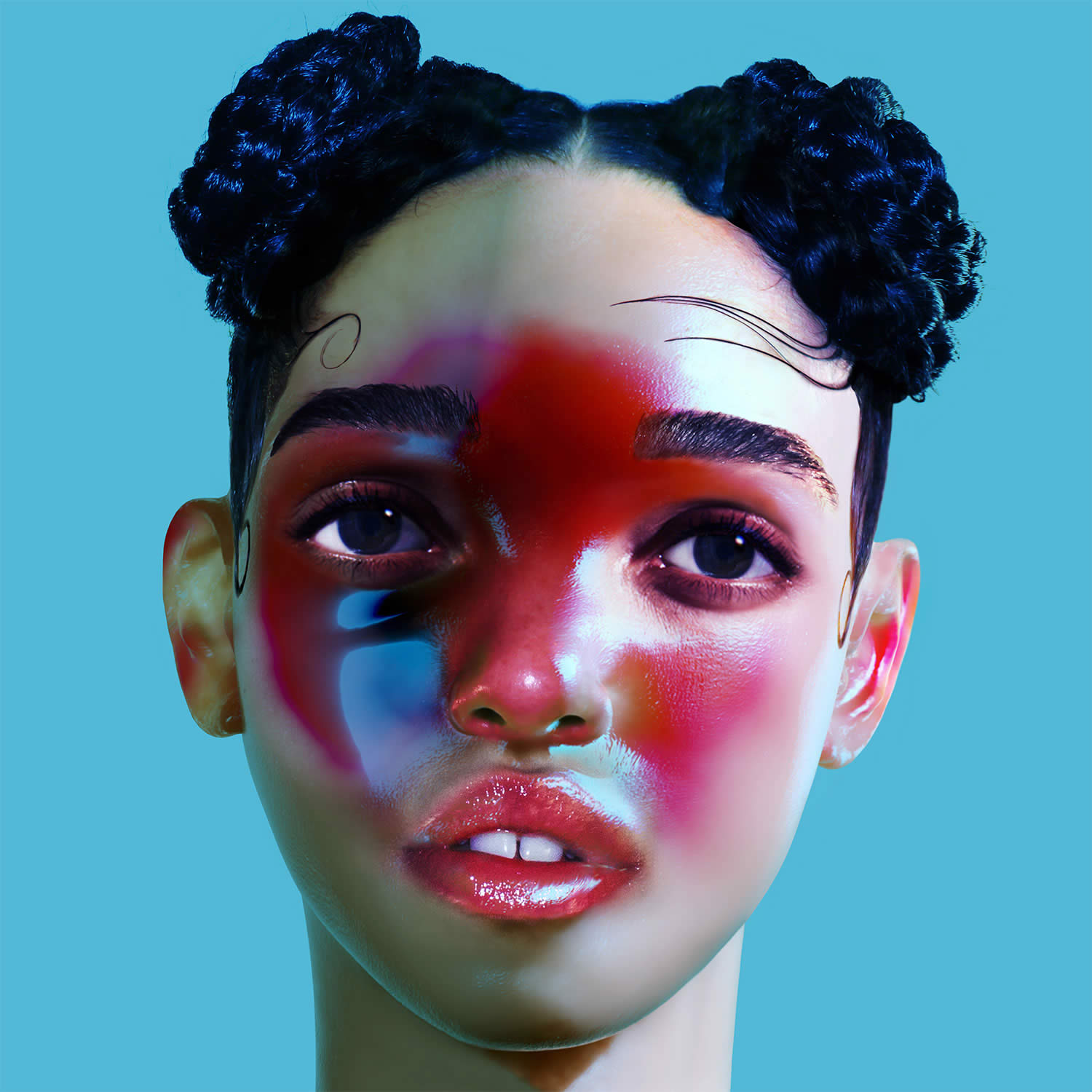
“Lp1” sold over four thousand copies in its first week; a promising debut album.
As much as I tried to ignore the “Lp1” cover, there is something intriguing about it. The magenta coloration on the girl’s face is almost a bruised tonality; leaving you curious as to what happened to her? If you look at alternative photos of the cover, you will see her face is actually disfigured; so indeed there is more to this. “Lp1” is FKA Twigs’ debut album which has been getting hype for its Mercury Prize shortlist for best British album of the year, in addition to the singer getting press for her rumored relationship with Robert Pattinson.
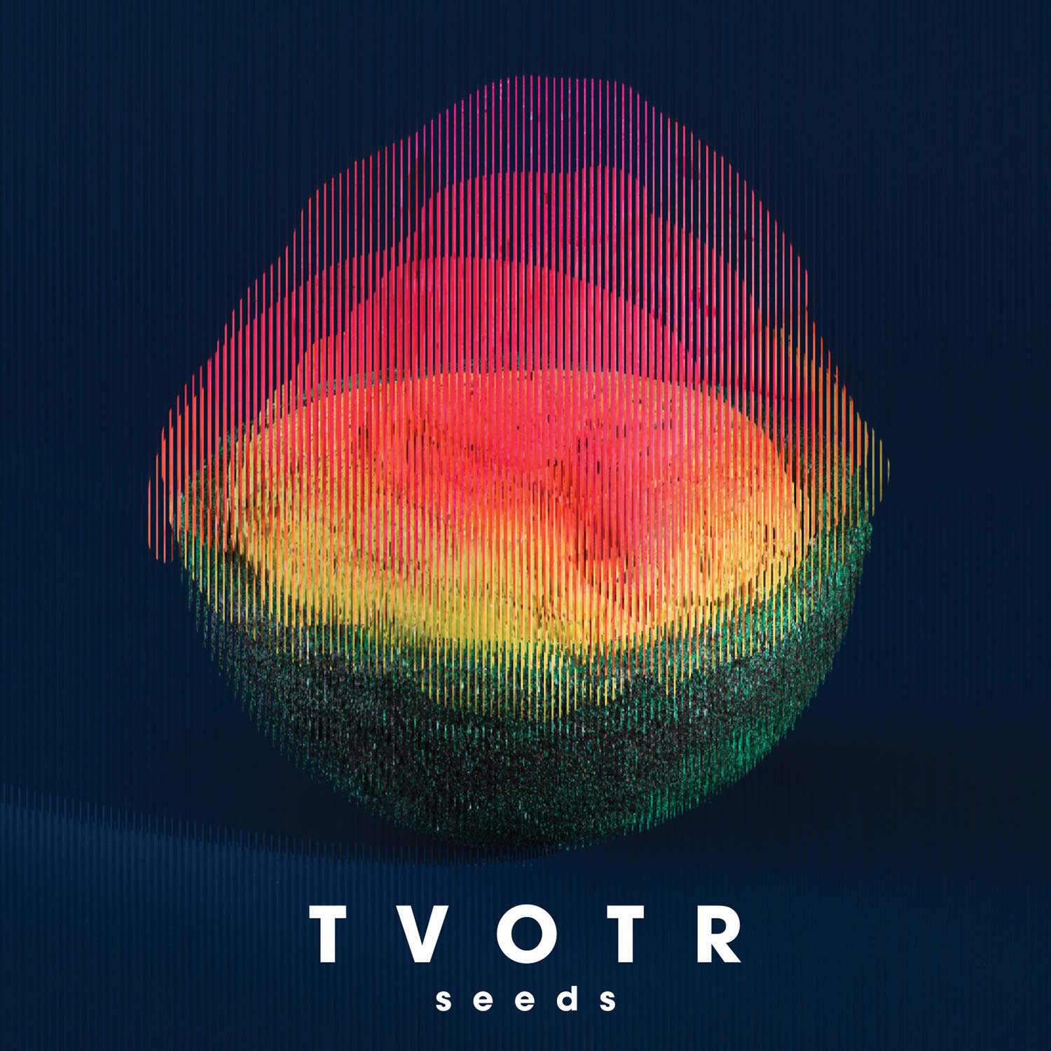
This is TOTR’s fifth album, their comeback since the death of their bassist Gerard Smith in 2011.
Seeds
American indie band TOTR (TV on the Radio) has a Cronenberg “The Fly” flair going on with their “Seeds” cover. Something is birthing here; a baby; an alien? A bit of mystery is good. The superimposed images have been dominant this year—both in illustration and photography—here, the images create an interesting gradient effect and the stripes resemble scanimation.
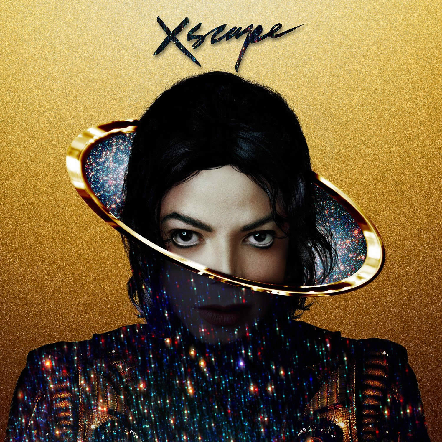
The album composition was inspired by an original photograph by Bill Nation.
Xscape
Many of us thought Michael Jackson had an alien quality, from look to personality, so it may be a coincidence that visual artist Mat Maitland illustrated him to look like an out-of-this-world being for the “Xscape” cover. It is actually a very cool idea! It isn’t frighteningly weird as Marilyn Manson posing for the “Mechanical Animals” album, but rather an into the future chill-out appearance for Michael Jackson. His head plus the turtleneck and gold ring look like the planet Saturn. There are three other futuristic portraits produced by Mailand on his website.
Sometimes simplicity is the best option for a cover design.
Awake
Scott Hansen is professionally known as Tycho, an ambient musician from San Francisco, California. What surprised me is I knew Hansen as a graphic designer (we have crossed paths online several times over the years due to his work on ISO50), but I didn’t know he was involved in music. His album “Awake” is what you would expect aesthetically from him: dreamy and minimalist, Cali-inspired with a refined Scandinavian-style design. You can view more of his album branding here.
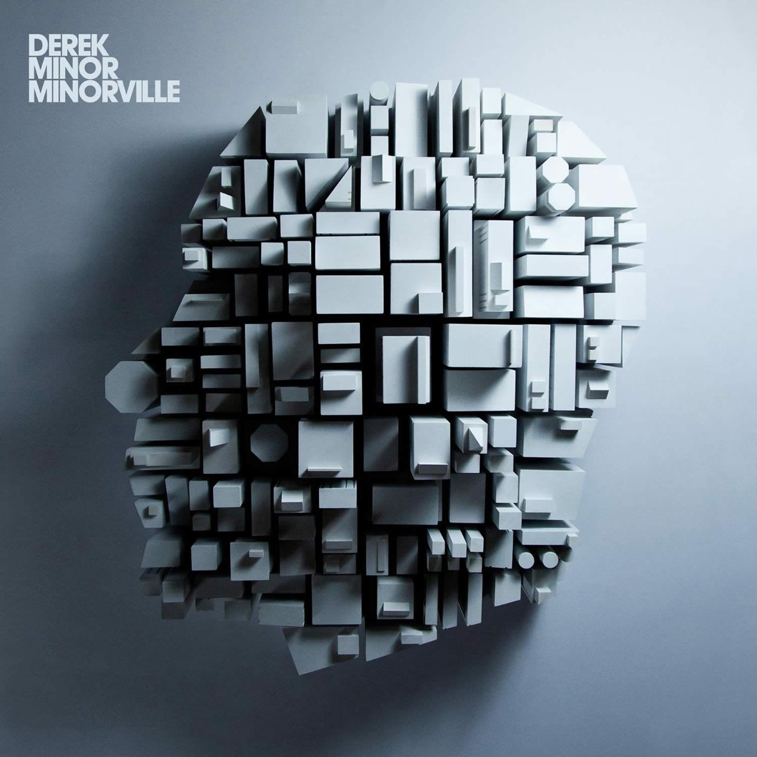
Take a tour around Minorville while listening to story-driven songs by Derek Minor.
Minorville
Nashville Christian rapper Derek Minor got inspiration for his latest “Minorville” from watching “Pleasantville” (1998; starring Tobey Maguire, Reese Witherspoon, William H. Macy and Joan Allen). A town where everyone and everything seems picture perfect, but underneath the surface there is more to the people and location. Minor’s goal for the album was to show the dynamics found in a city, from rich areas to suburbs to projects (different social classes), and highlighting that problems exist everywhere. The diversity of people and different sections of the city are represented through the 3D shapes of the cover, and keeping the image neutral-toned reflects the black-and-white styling of the movie.
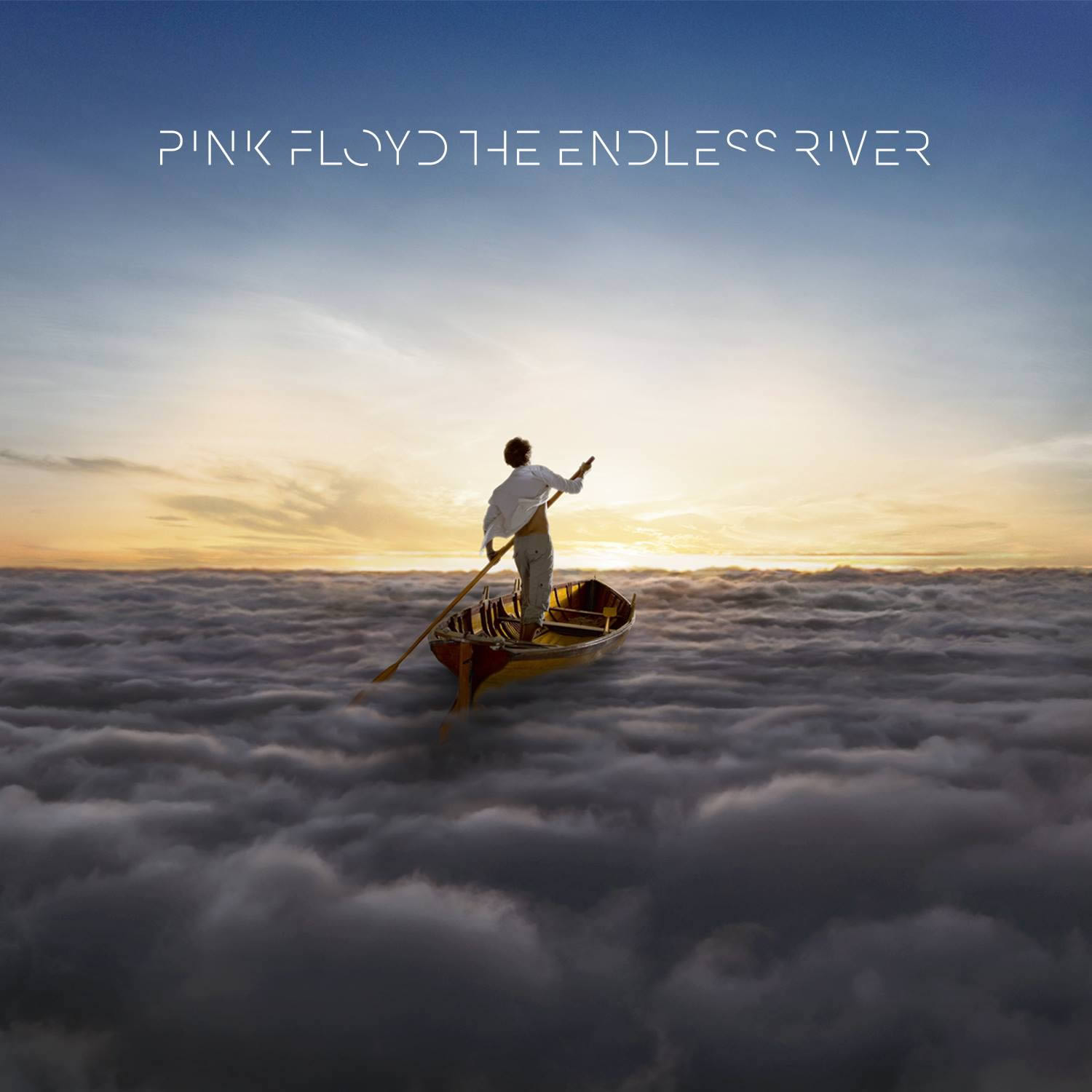
Lots of instrumental and ambient music can be heard in Pink Floyd’s fifteenth album.
Endless River
Two decades after the release of Pink Floyd’s “The Division Bell,” the band launches “Endless River” which will likely be their last album. An enigmatic title and visual to represent it, but not illustrated by renown graphic designer Storm Thorgerson who passed away in 2013. (A big bow to his masterful album art.) The band and art director Aubrey Powell had to find another artist, so through Behance they contacted an 18-year-old digital artist Ahmed Emad Eldin (from Egypt) who worked on the cover. Wow, it must have been his lucky day.

Arms and Sleepers (Max Lewis and Mirza Ramic) remember their childhood obsessions in the making of “Swim Team.”
Swim Team
I see mountains, sea, a face… it is starting to sound like a Rorschach test. This is Arms and Sleepers’ new work fusing instrumental hip-hop, R&B and electronica, in attempt to capture nostalgic moments from their past. It goes back to the 80s, inspired by their childhood obsessions and wanting to bring it back through sound. There are complex melodies and upbeat rhythms and textures, all of this mirrored dynamically in the album cover. The artwork may even remind you of “Range of Light” by S. Carey, the crisscross of the mountains. A light and airy feel—creating a sense of well-being, comfort.
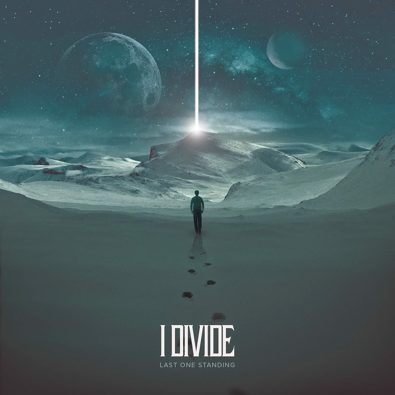
“Last One Standing” unveils an emotional and personal journey of I Divide.
Last One Standing
At first glance it looks like a scene from Christopher Nolan’s new sci-fi film, “Interstellar.” Otherworldly images have been trendy in 2014, giving viewers a visual escape into an unknown territory. The petroleum-blue hue creates a peaceful feel to the land and sky, almost like you are looking at an aurora borealis in Norway. The cover is connected to British band I Divide’s introspection of their lives—just listen to “Last One Standing,” “Monster in Me” and “Living in a Hurricane.”
Images © respective artists and music labels