If the beginning of 2016 is any indication, it’s going to be a phenomenal year for illustration. Already, creatives have wowed us with their technique and compelling subject matter.
The field of illustration—best known for accompanying book covers and editorial articles—can introduce just about any topic and format, giving creatives the freedom to explore and experiment with technique and their visual language. Some reference pop culture while others take a more personal approach and are inspired by the world around them.
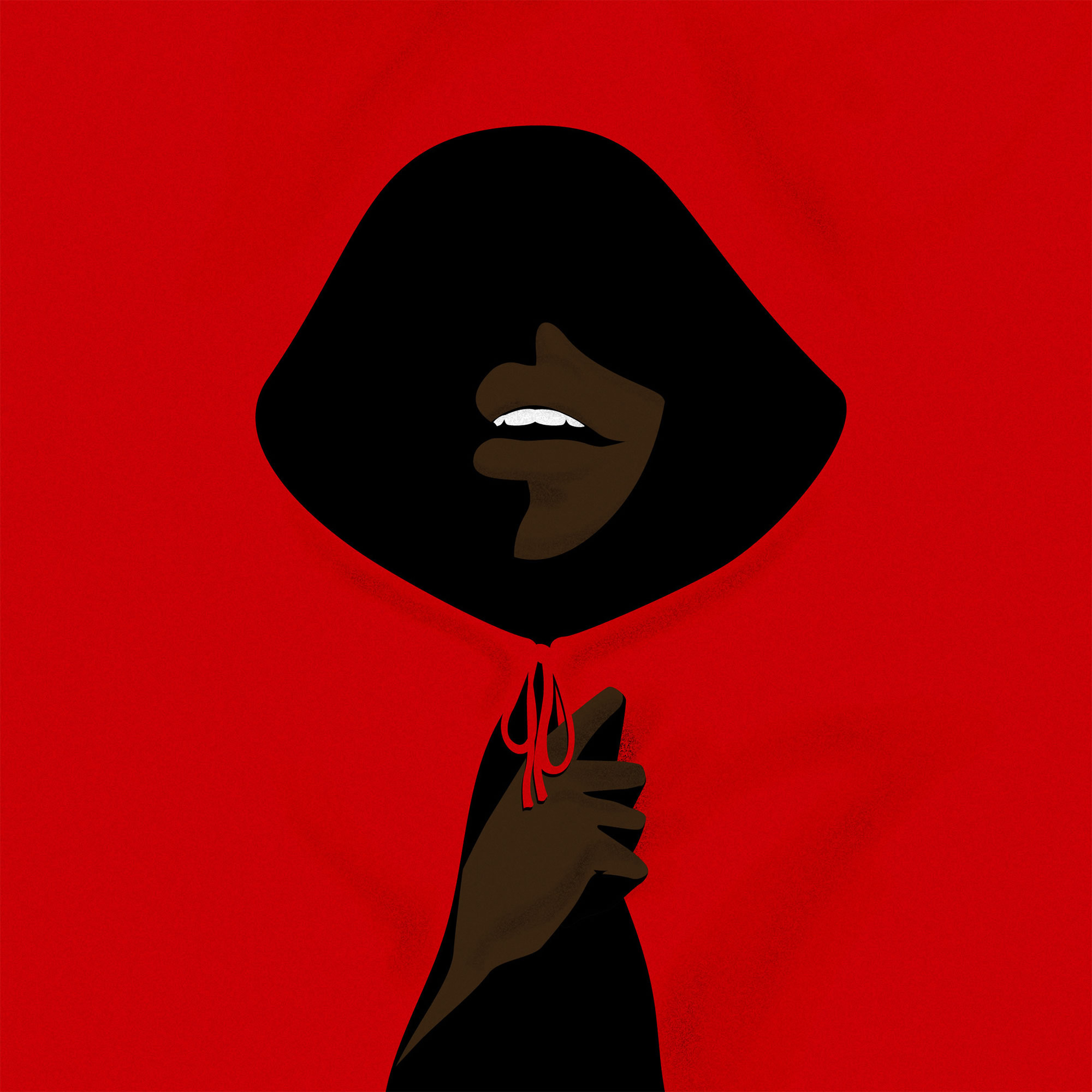
“Little Red Riding Hood” by Mario Supa says a lot with a few well-placed visual elements.
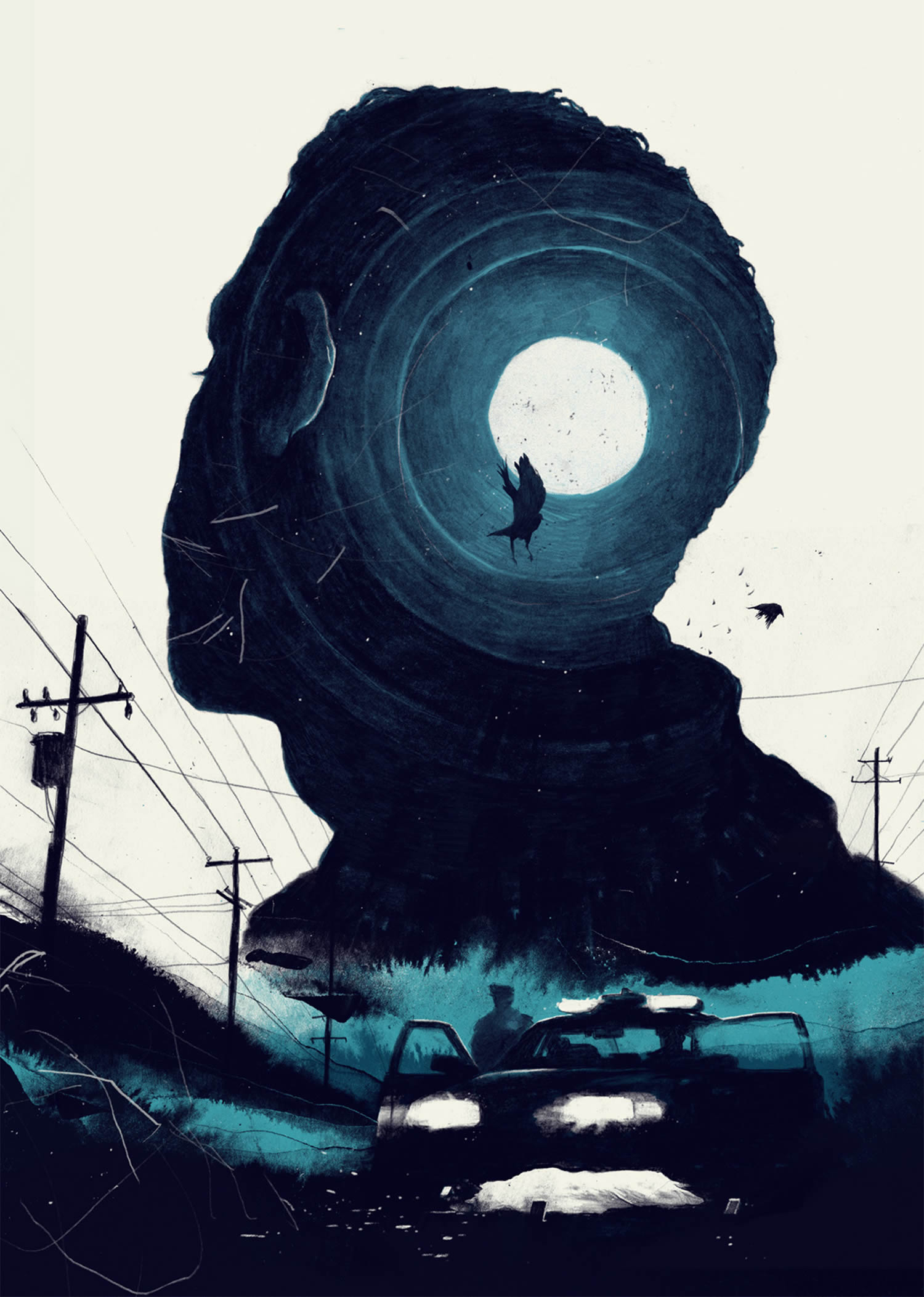
Within this man, strong memories remain.
Simon Prades
Double exposure effects are a product of photography, but their alluring, surreal characteristics translate into illustration, too. Simon Prades features this effect in a mysterious portrait where the dark of night is contained within a man’s silhouette face. To create the piece, Prades worked in analog mediums such as ink and pencil, using the computer as merely a tool to put the finishing touches on it.
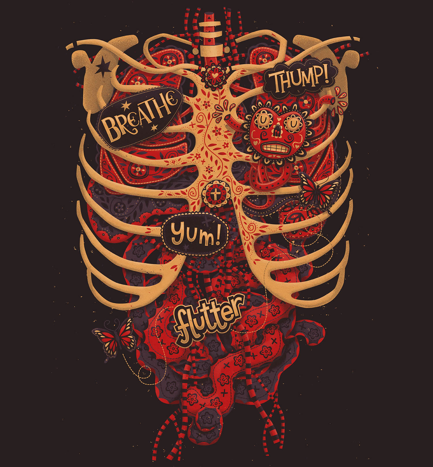
Steve Simpson has applied the sugar skull aesthetic to the rest of the body.
Steve Simpson
Steven Simpson was inspired by the Mexican holiday “Day of the Dead” (Día de los Muertos) and used its imagery in an anatomical illustration. A heart, intestines, lungs, and more are adorned with flower patterns, transforming them from visceral to beautiful. The colorful design was incorporated into a jacket at RAGEON.
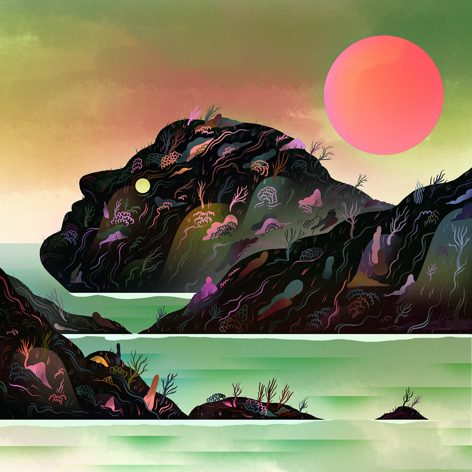
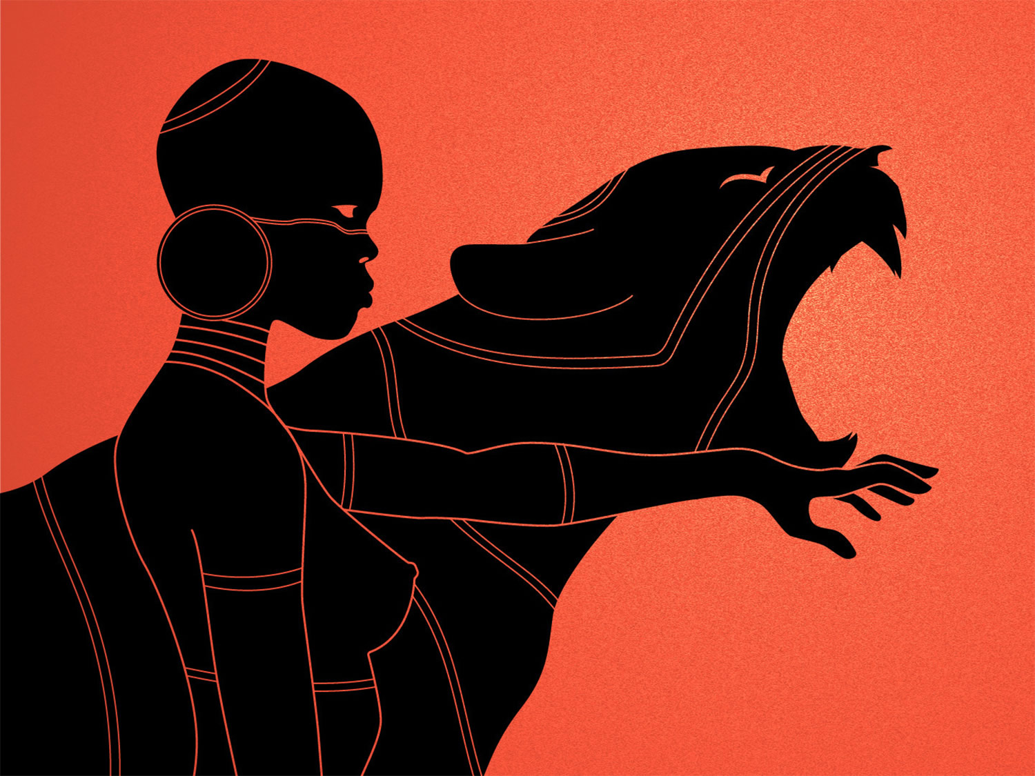
The plants are the only things keeping this island/man company.
Scott Balmer
There’s an old adage that states “no man is an island,” but in the case of “Land Mass” by Scott Balmer, he is one. Using a combination of natural textures and digital techniques, he’s created a place of splendor with electric neon colors. One striking element is the character’s yellow eye—though it shines with vibrant life, the man is stuck and utterly powerless. His only hope is that some one or some thing arrives to this strange land and frees him from his solitude.
With just two colors Mariosupa conveys multiple, easy-to-recognize forms.
Mariosupa
A simple image often has an incredible amount of visual ingenuity by stripping a subject down to its vital elements. Mario Hounkanrin (aka Mariosupa) does this with his illustrations and pairs a minimal color palette with shape design. Their contrasting characteristics work together to form compositions that are instantly understood by the viewer. This clarity comes from his long career as a graphic designer, where communication is integral to a work’s success. Mariosupa’s intelligent approach proves that a lot can be said with just a few key details.
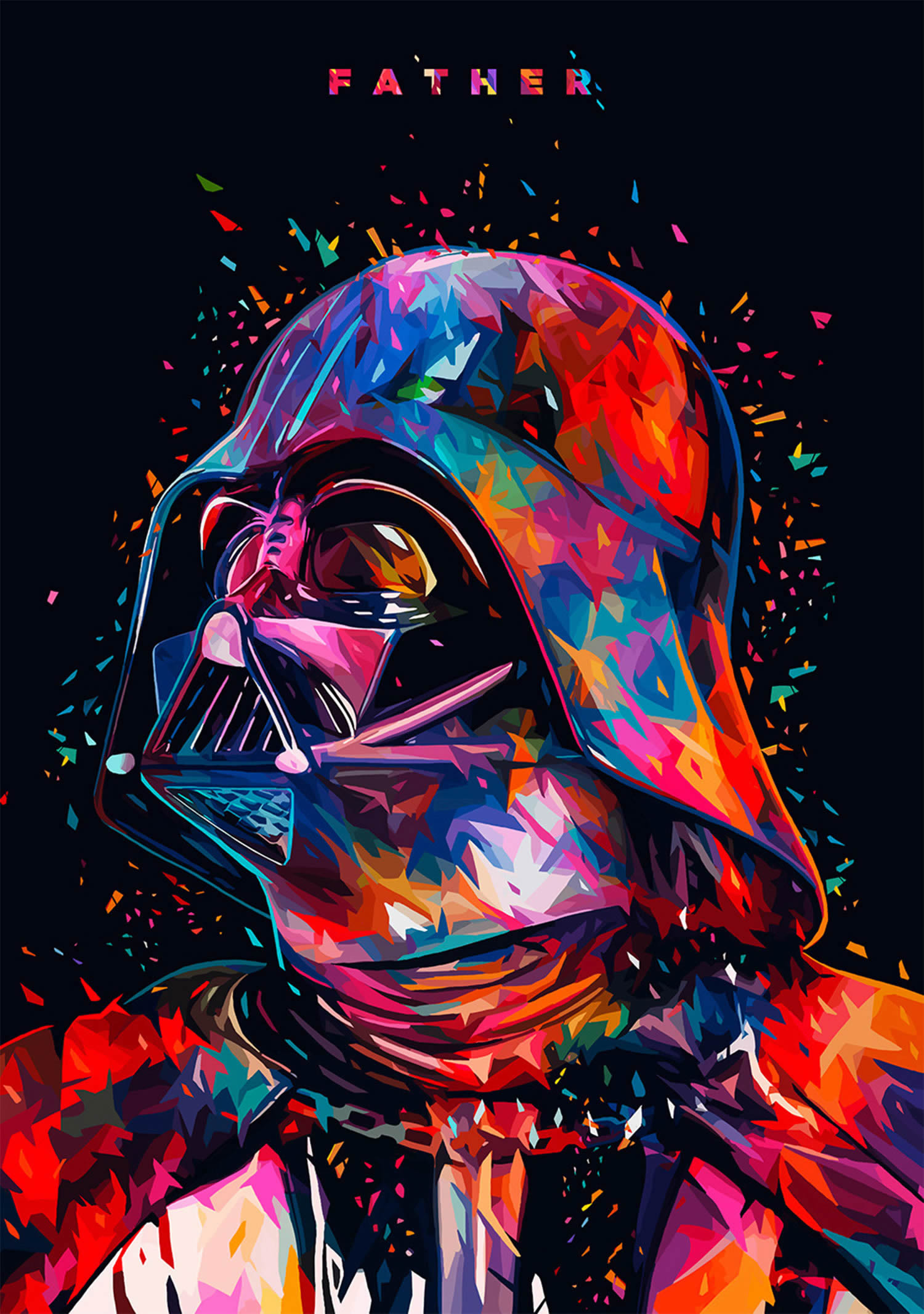
Darth Vader is one part of the larger “Star Wars Tribute” series.
Alessandro Pautasso
The inner darkness of Darth Vader has a colorful makeover thanks to Alessandro Pautasso. In his “Star Wars Tribute,” he replaces the pitch-black mask and cloak with fractured rainbow shapes—his striking characteristic style. This bright palette gives an optimistic tone to a film series that’s ripe with moments of utter despair and betrayals.
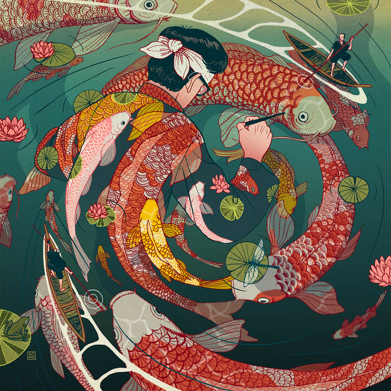
The hypnotic swirling fish transport the traveler to another period in time.
Nicolás Castell
Nicolás Castell imagines what it’d be like if a foreign artist traveled back in time to ancient Japan. Titled “Ukiyo-e Tale,” this traveler discovers a magic pen that allows him to create whatever he wants. “The influence of Japan in my work is evident,” Castell writes, “I wanted to create a story placed in this marvelous country, as an homage to the aesthetics of the ukiyo-e.”
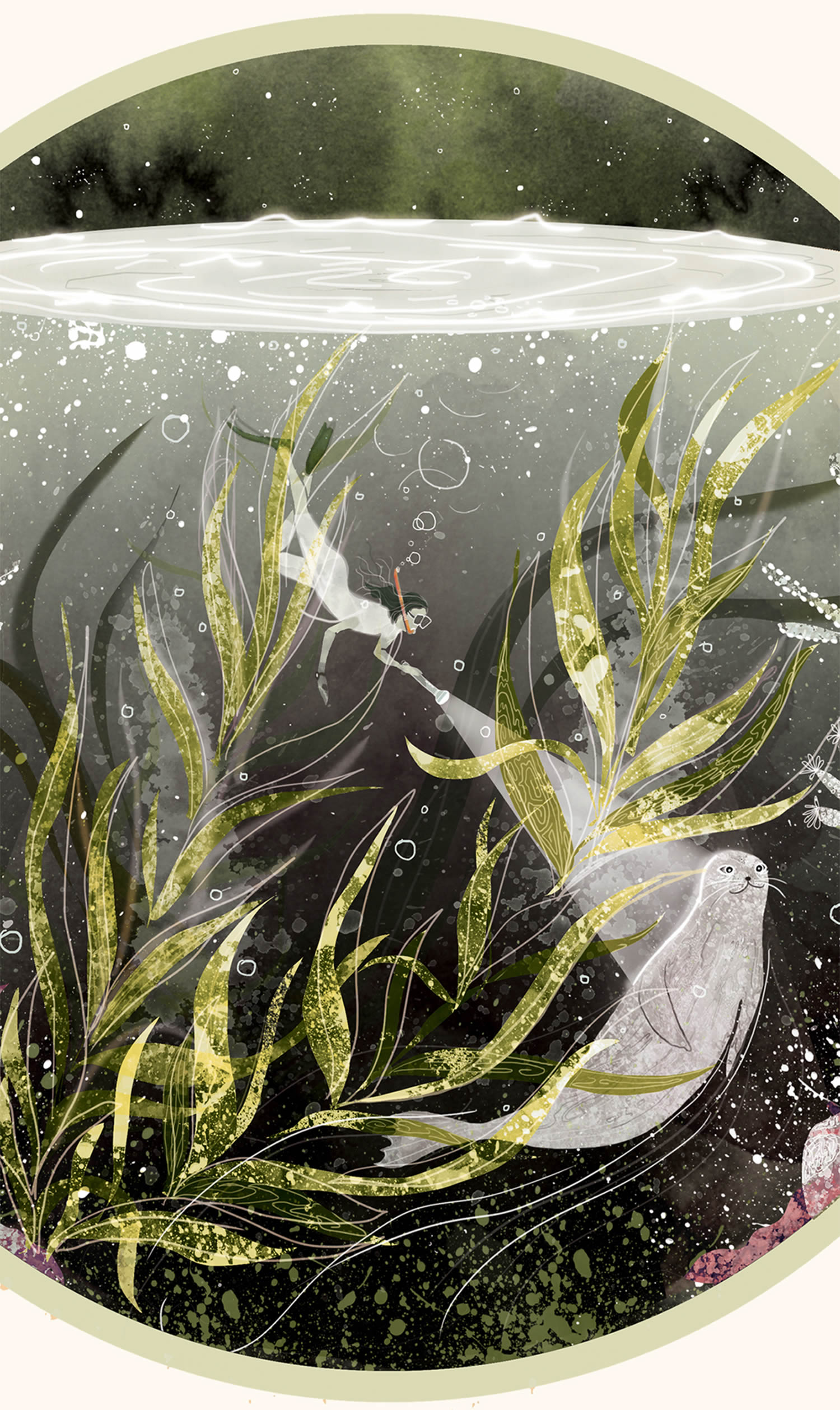
Svabhu Kohli’s illustrations pay homage to beauty of the Earth.
Svabhu Kohli
The ocean is full of mystery, one that Svabhu Kohli explores in an exquisite multilayered illustration. What could’ve been a simple digital composition is enhanced with distressed textures, making it appear hand-crafted despite the fact it was completed in Photoshop. Kohli is known for this artistic approach and has applied it to other Earth-centric imagery, including the TedX Bangalore Artistic Collective with 11 other artists.
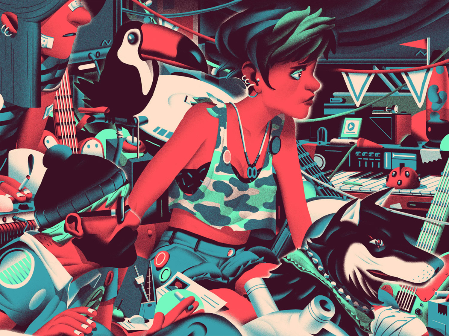
The cluttered room speaks to the nature of creation.
Nicolas Dehghani
Illustrator and director Nicolas Dehaghani has made a mess of this room where a trio of people and their animal companions reside. Musical instruments are strewn about, leading us to believe that they’re in some sort of recording studio. The frenzy of objects—crafted in a vibrating color palette, speaks to the creative process: when you’ve got a great idea, you can’t seem to move fast enough to write it down or record it and you pay the mess no mind.
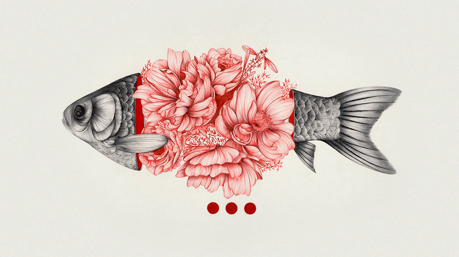
“To Bloom Not Bleed” is a personal project featuring a few iterations of this same idea.
Peony Yip
What if, instead of oozing blood, we sprouted flowers? “To Bloom Not Bleed” by Peony Yip illustrates this idea, portraying “the fine line between the grotesque and beauty of death.” A gutted fish, instead of looking limp and lifeless, reveals its insides to be a bouquet of peonies and roses. It’s a notion that makes death appear almost romantic.
Marynn also takes inspiration from music.
Marynn
The heartache is palpable in this illustration titled “Head Turner” by Marynn. Inspired by the people that surround her and their stories, this image depicts a fleeting moment. “When you cross a girl in the street you ask yourself for one second if you should turn back to see her face again,” Marynn writes. “This was one second too late, she has passed and you only have her back, her perfume and a taste of regret.”
Images © respective artists.