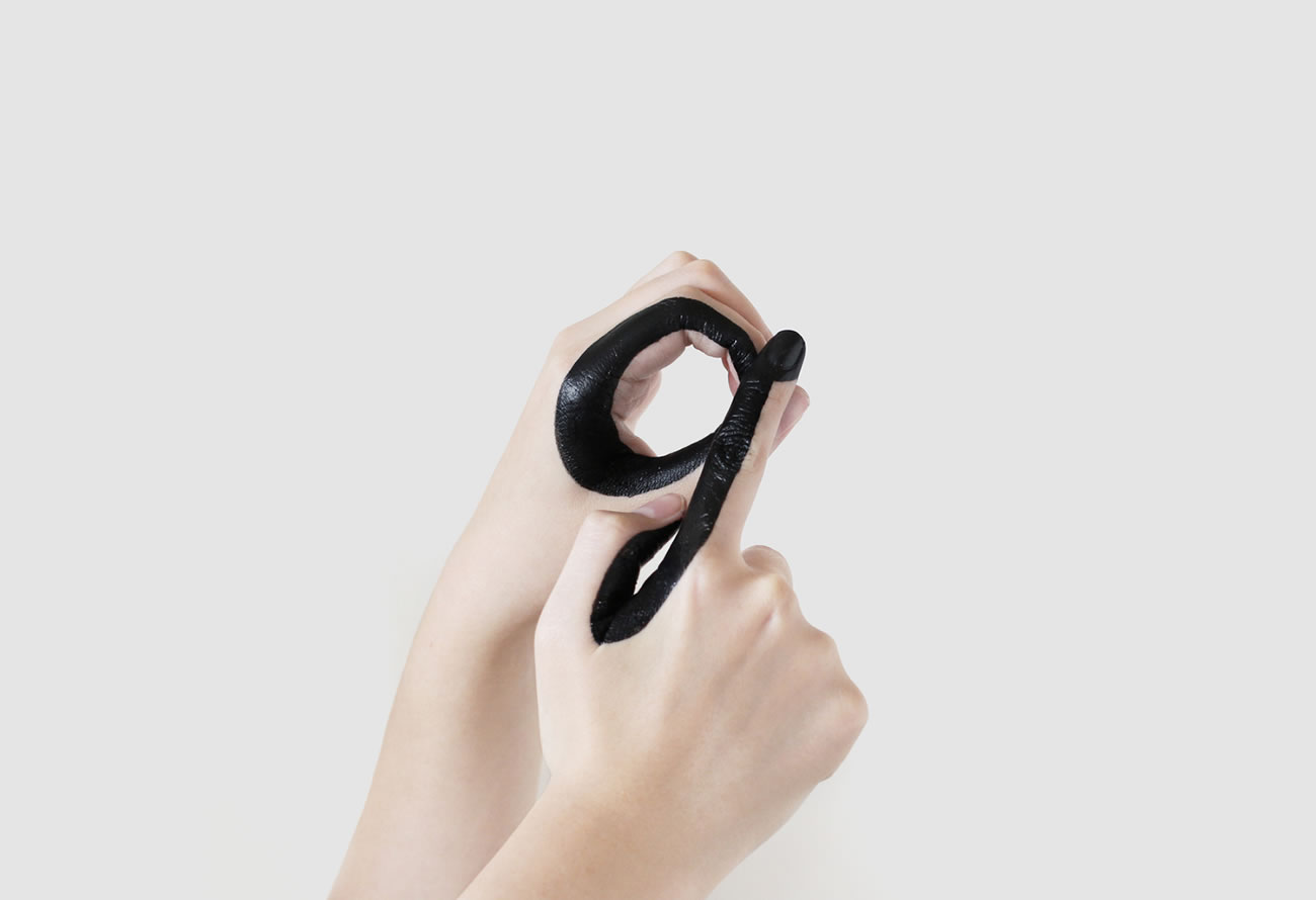
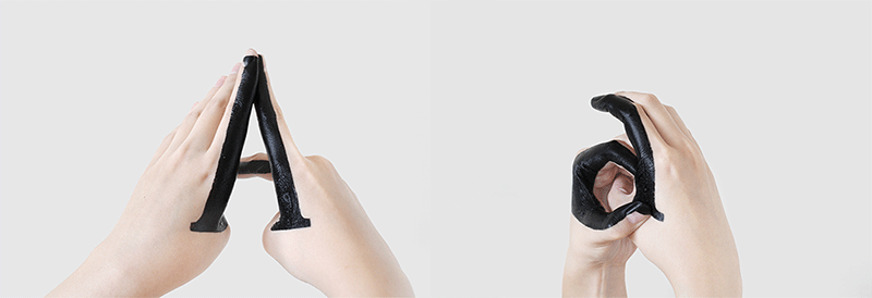
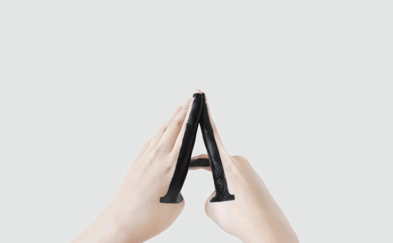
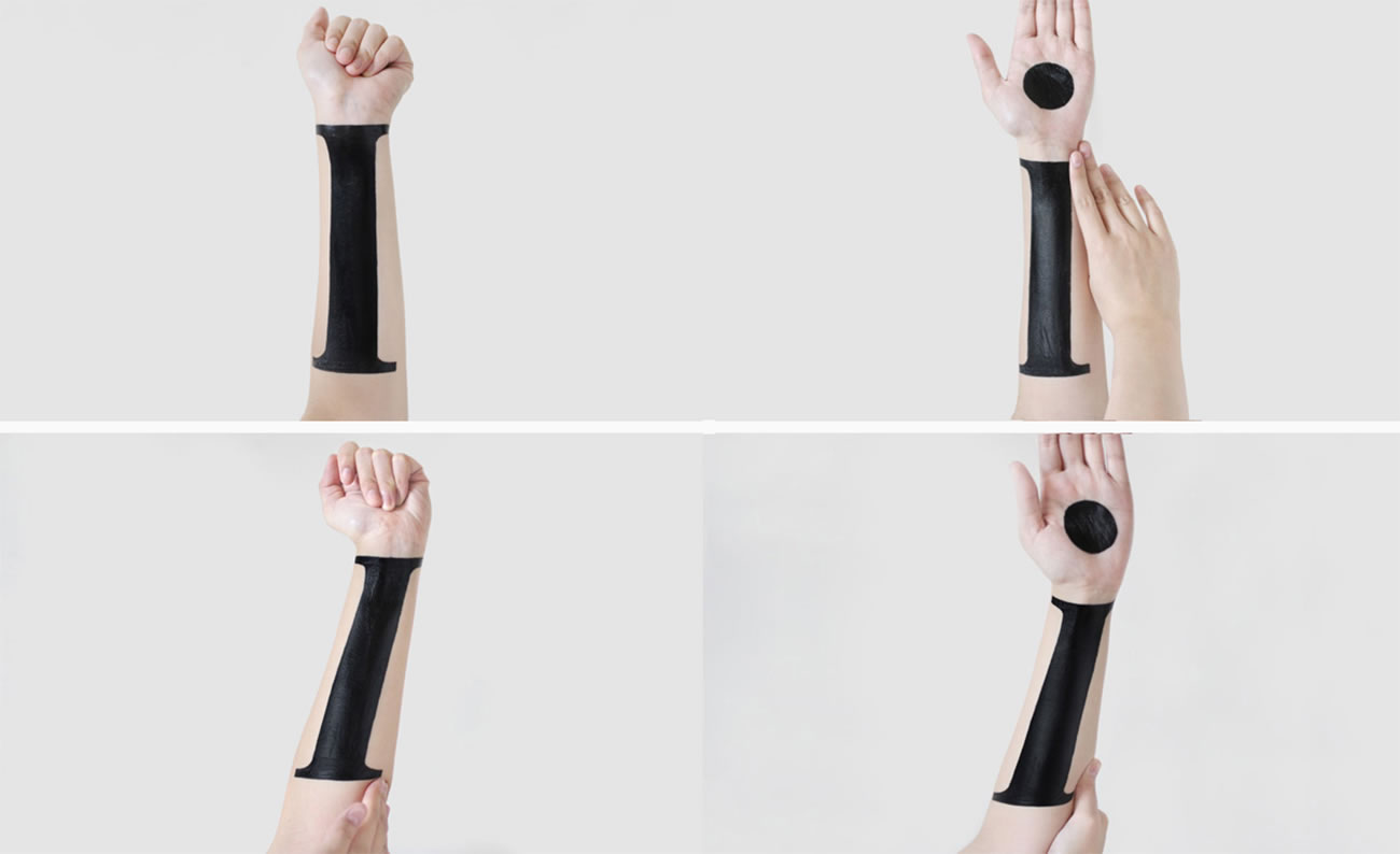
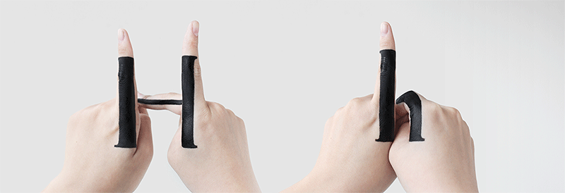
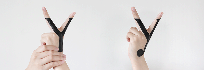
NY based graphic designer Tien-Min Liao experiments and studies the relationship between upper and lowercases. For each alphabet letter, the rules were she would paint black shapes on her hands but without additional editing, and with gestures she would have to form the two letter cases. It may look simple, but it is quite challenging to execute. Another interesting aspect is she was able to produce italic styling, you can see an example within post of the letter i.
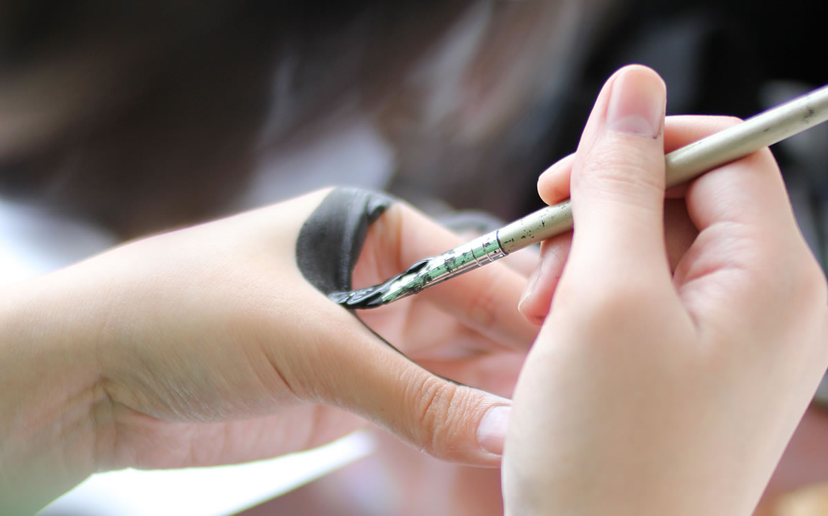
Photos © Tien-Min Liao

Via Designaside