
It has been a strong first half of the year for new albums and their cover art, from Blur’s comeback record to Father John Misty’s standout “I Love You, Honeybear,” and this has continued on from last year, with excellent outputs by the likes of S.Carey and The Antlers.
Going solely on the art merits of each of the chosen candidates, I have attempted to present a diverse range of different styles, from illustration and photography through to digital art and exciting experiments in typography. So settle in, get comfortable and get ready to enjoy some inspiring album artwork.
Top: Alternative cover design for Blur’s “The Magic Whip.”
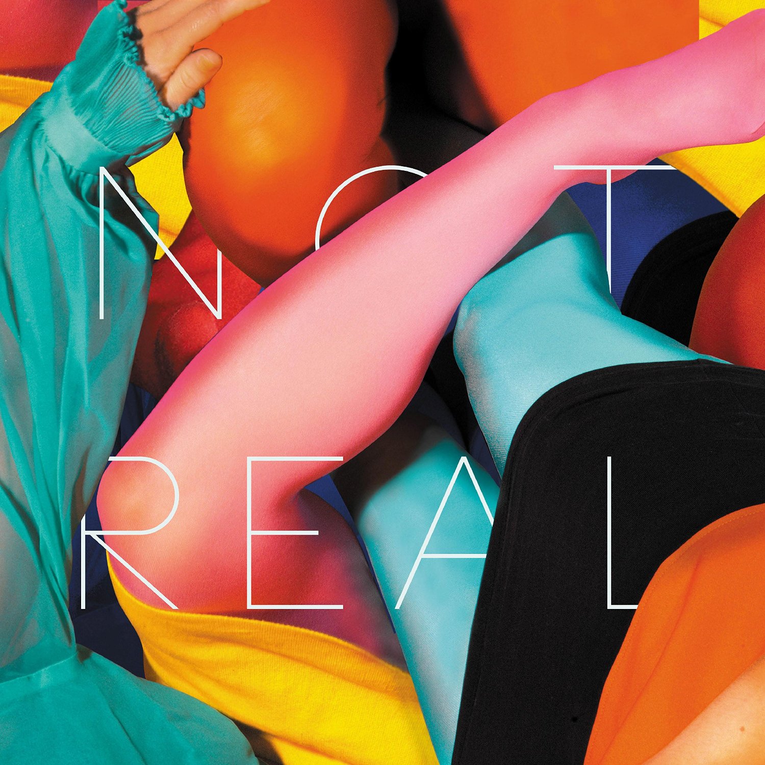
Plenty of citrus colours and edgy typography by Stealing Sheep and Sawn Off.
Stealing Sheep
The trio of English alt-folksters Stealing Sheep released their sophomore effort earlier this year, “Not Real,” to great reception. Artwork for the record is by collective Sawn Off, a beautiful piece of graphic design where the eye is drawn into a sea of bright colours. The words almost seem to get lost in the collection of neon cloth.
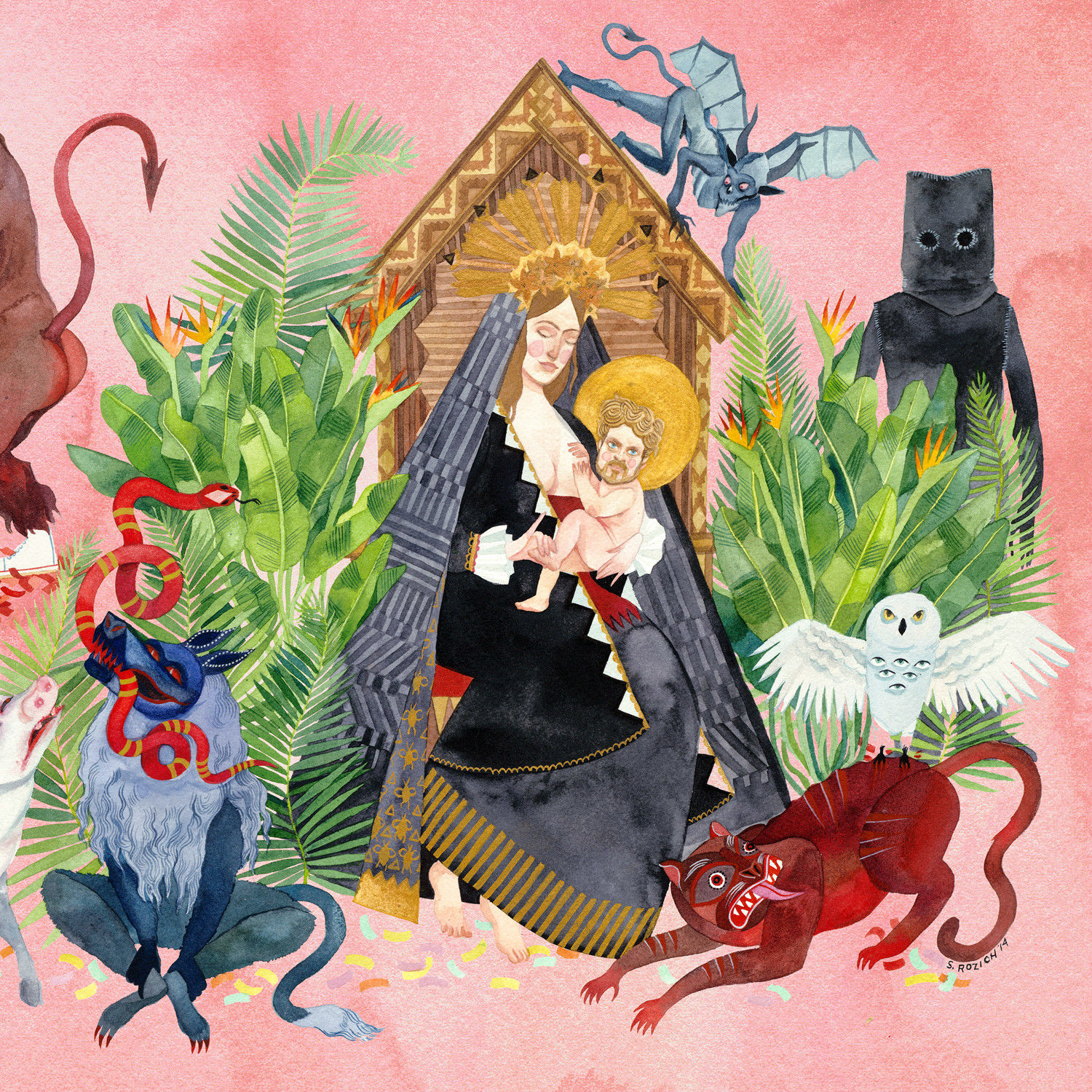
Fabulously weird imagery courtesy of Alia Penner.
Father John Misty
Father John Misty is psychedelic persona created by American musician Josh Tillman. This mad preacher has been met by adorning arms and his second release came out in February: “I Love You, Honeybear.” The cover illustration by Alia Penner is a surreal, pagan delight full of religious imagery and pastel colours.

A sleek album sleeve gives Leon Bridges an added edge.
Leon Bridges
The image of this youthful Texan soul singer has been carefully cultivated so that he looks like he has stepped out of small American town in the 1950s. This mood comes across effectively on the cover of his debut release, “Coming Home.” Stepping right out of the glory days of Motown, the design features strong colours with the song titles on the front. Two hallmarks of that great era of music.
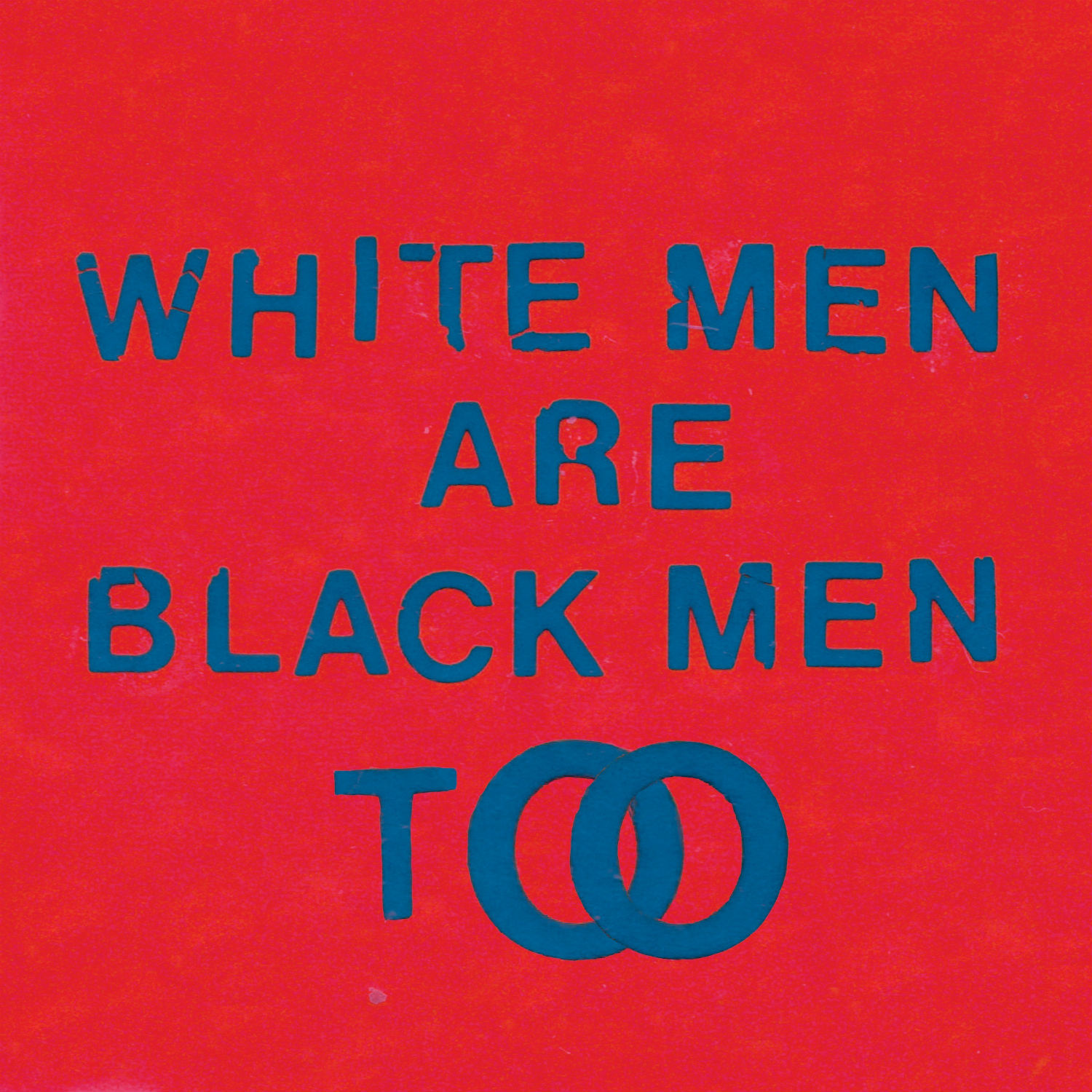
Sometimes all you need is words, as demonstrated by Young Fathers.
Young Fathers
For their second full-length studio album, Edinburgh-based hip hop trio Young Fathers have created a powerful design to match their impressionistic sound. Against a red background the controversial title is written across in block lettering. Simple and effective.

Art Director Tony Hung interprets Blur’s “The Magic Whip.”
Blur
For a band as iconic as Blur and especially one who have always gone for interesting choices in the past for their album covers, their reunion record had to be something special. While the music has been lauded, the design is just as fascinating as usual: we’ve got a neon ice-cream cone and Chinese letters created by Tony Hung. All in all it perfectly captures the phrase “The Magic Whip.”

A gorgeous origami bird graces Stornoway’s latest record.
Stornoway
“Bonxie” is the latest studio album by the indie folk band Stornoway from Oxford. In case you were wondering, the word bonxie is an old Norse word from the Shetland Islands for a Great Skua. These kind of obscure nature references are common for this group, who seek a lot of their inspiration from the flora and fauna of the British Isles. The cover illustration of an origami bird is the perfect visual metaphor for the sounds hidden inside.
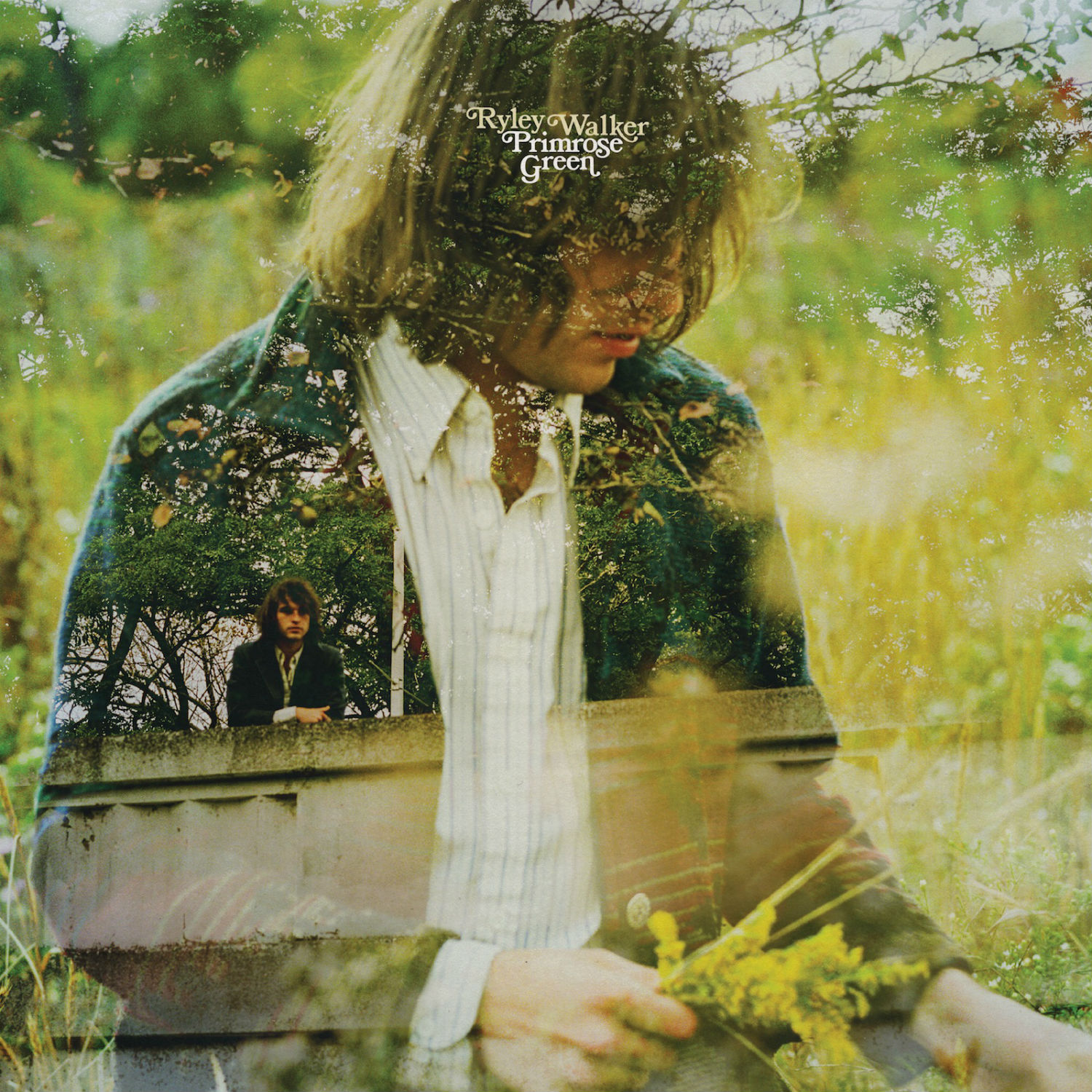
Double-exposure photography is used to marvellous effect for Ryley Walker’s debut.
Ryley Walker
Ryley Walker makes hazy-tinged folk rock that harks back to the heydays of the 1970s. His debut album “Primrose Green” (a type of pot apparently) features on the front of it a gorgeous double-exposure photograph, combining a portrait of Walker with plenty of lush greenery.
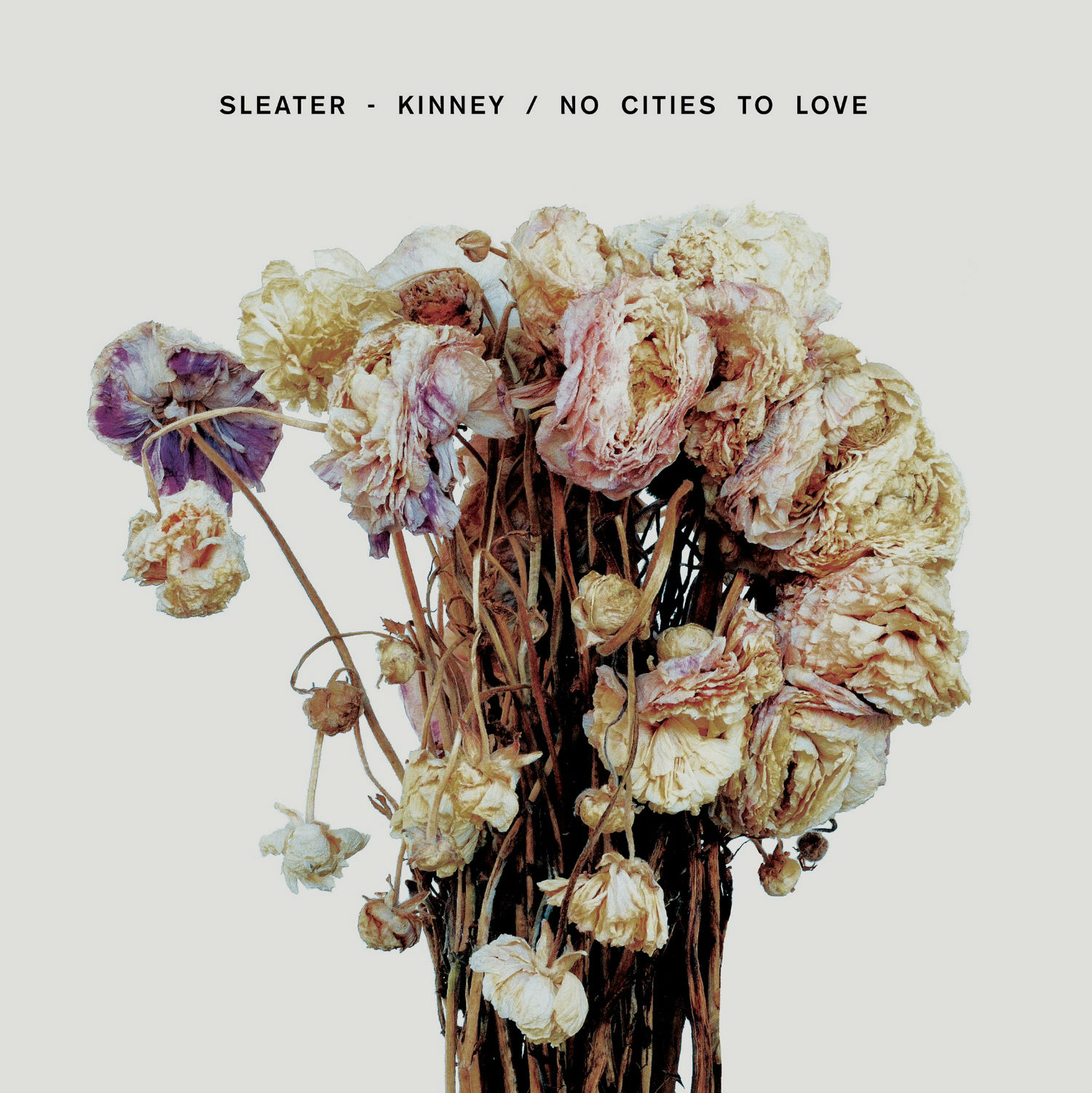
Sleater-Kinney keep things simple for “No Cities to Love.”
Sleater-Kinney
Pioneers of the feminist Riot Grrrl movement in the 90s, Sleater-Kinney made a handful of acclaimed records before taking a long hiatus. Thankfully they’re back and their new album “No Cities to Love” has a lovely cover art. A minimalist photograph of a fading vase of flowers is striking choice and combined with the simple lettering, it is an understated delight.
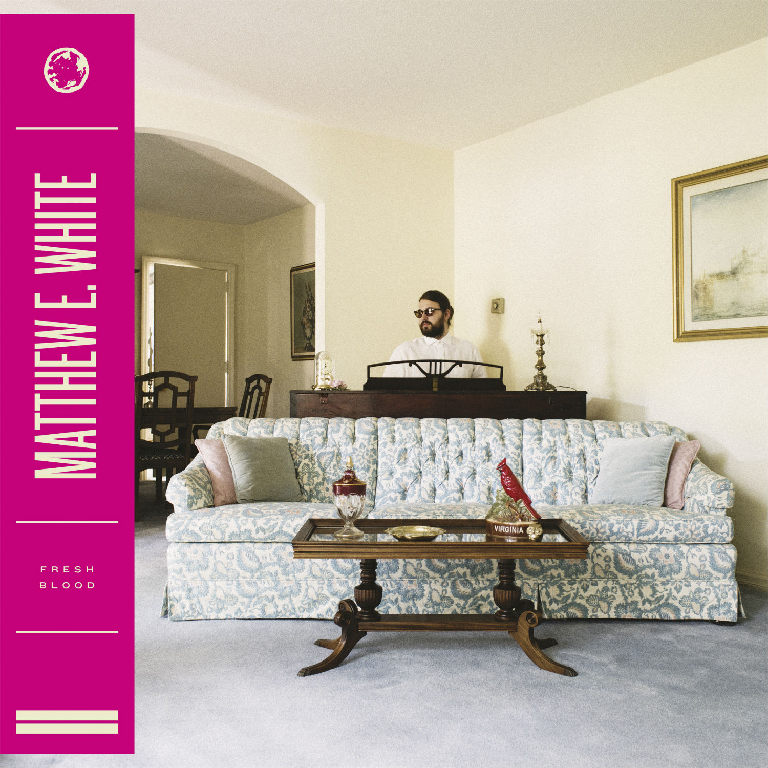
Matthew E.White orchestrates a lavish piece of cover art for “Fresh Blood.”
Matthew E. White
Founder of Spacebomb Records in Richmond, Virginia, Matthew E. White has a distinct visual style that can be seen in the artwork for his own releases. A perfectly composed image of the artist sits alongside a coloured bar with the typography. It is the same layout for all the artists who bring out their music on Spacebomb.
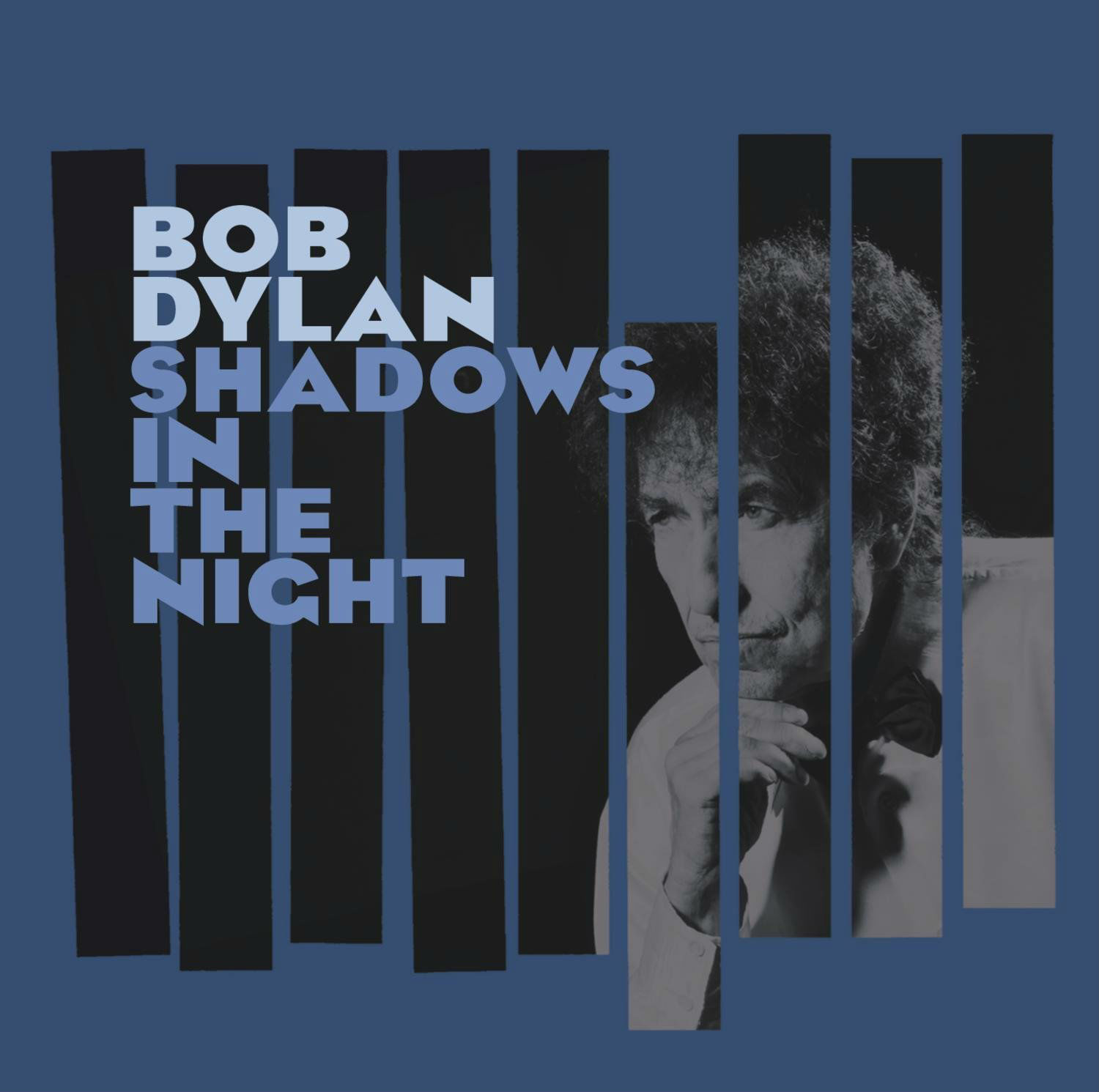
Straight out of the heart of the Rat Pack era for Dylan’s latest.
Bob Dylan
Reaching studio album number 36 is an impressive feat for an artist, so Dylan certainly deserves high credit for reaching that figure. His latest release is a collection of Sinatra covers, and the design for the sleeve definitely harks back to the glories of the Rat Pack with its repeat of geometric lines and dark colours.
Images © respective record companies and artists.